
Shirt Stade Rennais FC Home 2026-2027: Analysis of the new kit
For the 2026-2027 season, Stade Rennais is offering a home jersey that remains true to its historical identity while incorporating a more sophisticated graphic approach.
This new version features a deep red base enhanced by tone-on-tone patterns inspired by Breton architecture. The result is a jersey with more texture and a richer visual appeal than previous editions.
In this comprehensive analysis, we examine the Stade Rennais home jersey 2026-2027 from the perspective of design, visual presentation and its overall identity.
Overall vision of the Stade Rennais 2026-2027 jersey
The 2026-2027 home kit is based on three main elements:
- preservation of the club's iconic red
- integration of Breton architectural motifs
- Black contrast to reinforce the visual structure
This construction allows Stade Rennais to retain its traditional identity while adding more graphic personality.
1. Stade Rennais 2026-2027 Home Shirt
Identity and inspiration
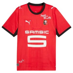
The Stade Rennais home jersey retains the historic red that has accompanied the club for several generations.
However, this version introduces a new graphic design with motifs inspired by half-timbered houses and traditional Rennes architecture.
The black trim at the collar and sleeves enhances the character of the jersey.
Visual analysis
The design is structured around several elements:
- a bright red base
- tone-on-tone geometric patterns
- contrasting black borders
The details integrated into the fabric add more texture and greatly enrich the surface of the jersey without compromising its legibility.
The white logos stand out immediately thanks to the contrast with the red background.
Match performance
On the field, this jersey offers:
- Excellent visibility thanks to the dominant red
- Clear reading of the sponsor and the crest
- strong visual presence under lighting
The patterns become more visible in motion and add a sense of depth.
Lifestyle use

This model works easily off the field thanks to its balance between simplicity and graphic details.
The dominant red combined with the black borders gives a modern look that is easily wearable on a daily basis.
Ideal profile
- supporters attached to the historic colors of Stade Rennais
- fans of textured and detailed jerseys
- fans looking for a more graphically polished version
- Ligue 1 jersey collectors
Customization recommended
White flocking is recommended to maintain a clean and legible contrast.
Comparison with previous Rennes jerseys
This 2026-2027 version is distinguished by:
- a more advanced graphic design
- visual references to the city of Rennes
- a more textured approach than previous editions
The club nevertheless retains a classic structure true to its identity.
Replica Version vs. Authentic Version
Replica:
- standard cut
- daily comfort
- slightly thicker fabric
Authentic:
- fitted cut
- lighter fabric
- design similar to that worn by the players
The ideal choice among the two versions of the Stade Rennais home jersey 2026-2027 will depend on the desired style.
Size guide
Standard fit: usual size recommended.
Performance fit: consider sizing up depending on preference.
Aftercare tips
- wash inside out
- Maximum temperature 30°C
- avoid the tumble dryer
- Do not go over the markings again.
FAQ – Stade Rennais home kit 2026-2027
Does the jersey retain the club's historical colours?
→ Yes, with a dominant red base and classic black details.
Are the patterns visible from a distance?
→ They remain relatively discreet but become more visible under light and in motion.
Is the jersey suitable for lifestyle use?
→ Yes, its balanced design works very well for everyday use.
Conclusion
Le Stade Rennais home jersey 2026-2027 succeeded in modernizing the club's visual identity without abandoning its historical foundations.
With its iconic red, architectural textures and elegant black finishes, this new version brings more personality while remaining true to the traditional image of the Breton club.